
An Important Concept in Photography
As Wikipedia defines it, the colour temperature of a light source is determined by comparing its colour within the visible spectrum with the light emitted by a black body heated to a particular temperature. For this reason, colour temperature is expressed in kelvin, even though it is not literally a measurement of the temperature of the light source itself.
But what is colour temperature actually useful for in photography?
When we are going to take a photograph, it can be useful to have a clear reference for what true neutral white should look like.
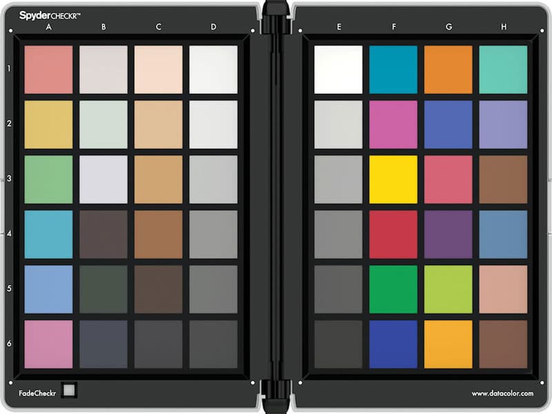
One practical way of obtaining this reference is to use a colour chart like the one shown above. By taking a photograph of the chart under the same lighting conditions in which we are going to work, we have a reliable reference for later processing.
When editing the image, for example in Camera Raw, we can use the white balance eyedropper to tell the software which area should be neutral.
If we click on a light grey area — or an area that should be light grey — the software compensates the RGB channels until that point becomes neutral.
For example, if the selected point had values such as:
R = 249
G = 250
B = 201
the white balance adjustment would compensate the colour difference so that the three channels become more balanced, and that correction would then be applied across the image.
But is this level of accuracy always necessary?
In reality, only in certain situations.
For example, when photographing a clothing catalogue or works of art, colour fidelity can be essential:

In the photograph above, accurate colour reproduction was important. The white of the wedding dress had to remain true to the original.

In this second image, exact colour temperature is much less important. The aim is to create the most visually striking photograph possible, so the white balance and overall colour can be adjusted according to the result we want.
Another thing to keep in mind is that even if an image has perfectly balanced colour on our computer, it may look different when viewed on another screen or printed on paper.
Most displays are not accurately calibrated for colour. In fact, many screens are deliberately configured with a cooler or brighter appearance because manufacturers believe it gives the impression of a more vivid image.
As a result, a photograph with carefully adjusted white balance may appear warmer, cooler or more saturated on another display. In some cases, highlights may even appear blown out when the original JPG file still contains detail.
The same thing can happen with photographic prints.
Unless you are using a professional printing service with proper colour management, laboratories may automatically modify the colours in order to produce more striking results from photographs taken with standard cameras.
When a professionally processed image is subjected to those automatic corrections, the result can actually become worse — often with excessive red or other colour shifts — and the carefully adjusted white balance is effectively lost.
Thanks for visiting!
Conversation